notetaking

Better learning through handwriting

One of the points I mention in my book on notetaking is that the very act of taking notes helps us remember — it’s not simply about providing yourself with a record. There are a number of reasons for this, but a recent study bears on one of them. The researchers were interested in whether physically writing by hand has a different effect than typing on a keyboard.

In a fascinating experiment, adults were asked to learn to write in an unknown alphabet, with around twenty letters. One group was taught to write by hand, while another group used a keyboard. Participants were tested on their fluency and recall after three and six weeks. Those who had learned the letters by handwriting were significantly better on all tests. Moreover, Broca's area, a brain region involved in language, was active when this group were recognizing the letters, but not among those who had learned by typing on a keyboard.

The findings point to the importance of sensorimotor processes in processes we have typically regarded as primarily intellectual.

I recently reported on another finding concerning handwriting — that the memory-blocking effect of exam anxiety could be overcome by the simple strategy of writing out your anxieties just before the exam. It’s also interesting in this context to remember the research into the benefits of gesturing for reducing the load on your working memory, with consequent assistance for memory, learning and comprehension. The writing effect on exam anxiety is also thought to be related to reducing the load on working memory.

In the case of this latest study, it seems likely that the benefits have more to do with the increased focus on the shape of the letters that occurs when writing by hand, and with the intimate connection between reading and writing.

But the message of these different studies is the same: that we ignore the physical at our peril; that cognition is “embodied cognition”, rooted in our bodies in ways we are only beginning to understand.

References

Mangen, A. & Velay, J. (2010). Digitizing Literacy: Reflections on the Haptics of Writing, Advances in Haptics, Mehrdad Hosseini Zadeh (Ed.), InTech, Press release at https://www.eurekalert.org/pub_releases/2011-01/uos-blt011911.php

The changing nature of literacy. Part 2: Lecturing

This post is the second part in a four-part series on how education delivery is changing, and the set of literacies required in today’s world. Part 1 looked at the changing world of textbooks. This post looks at the oral equivalent of textbooks: direct instruction or lecturing.

There’s been some recent agitation in education circles about an article by Paul E. Peterson claiming that direct instruction is more effective than the ‘hands-on’ instruction that's so popular nowadays. His claim is based on a recent study that found that increased time on lecture-style teaching versus problem-solving activities improved student test scores results (for math and science, for 8th grade students). Above-average students appeared to benefit more than below-average, although the difference was not statistically significant.

On the other hand, a college study found that a large first-year physics class taught in a traditional lecture style by an experienced and highly rated professor performed more poorly on several measures than another class taught only by engaging in small-group problem-solving tasks. Attendance improved by 20% in the experimental class, and engagement (measured by observers and "clicker" responses) nearly doubled. Though the experimental class didn’t cover as much material as the traditional class, dramatically more students showed up for the unit test, and they scored significantly better (average score of 74% vs 41%).

It must be noted, however, that this experiment only ran for a week (3 hours instruction).

But the researchers of the middle-grade study did not conclude that lecturing was superior, or that their results applied to college students. Their very reasonable conclusion was that “Newer teaching methods might be beneficial for student achievement if implemented in the proper way, but our findings imply that simply inducing teachers to shift time in class from lecture-style presentations to problem solving without ensuring effective implementation is unlikely to raise overall student achievement in math and science. On the contrary, our results indicate that there might even be an adverse impact on student learning.”

The whole issue reminds me of the phonics debate. I don’t know what it is about education that gets people so polarized, when it seems so obvious that there are no simple answers. What makes an effective strategy is not simply the strategy itself, but how it is carried out, who is using it, and when they are using it.

In this case, the quality and timing of these ‘problem-solving activities’ is perhaps central. The rule of thumb that twice as much time should be allocated to problem-solving activities as to direct instruction is perhaps being applied with too little understanding about the role and usefulness of specific activities.

But it’s obvious that there are going to be strong developmental differences. The ‘best’ means of teaching 18-year-olds is not going to suit 5-year-olds, and vice versa. So we can’t conclude anything about middle school by looking at college studies, or college by looking at middle school studies.

So, bearing in mind that a discussion of college lecturing has little to do with direct instruction in schools, let’s look a little further into college lectures, given that this is the predominant method of instruction at this level.

First of all, we must ask what students are doing during lectures. Given many teachers’ distress at their students’ activity on phones and laptops during class, it’s worth noting the findings of two recent studies that spied on college students in class rather than relying on self-reporting.

The first study involved 45 students who allowed monitoring software to be installed. Distinguishing between “productive” applications (Microsoft Office and course-related websites) from “distractive” ones (e-mail, instant messaging, and non-course-related websites), the researchers found that non-course-related software was active about 42% of the time. However only one type of these distractive applications was significantly correlated with poorer academic performance: instant messaging. This despite the fact that IM windows had the shortest average duration. (It’s also worth noting that instant-messaging use was massively under-estimated by students (by 40% vs, for example, 7% for email use)).

It seems likely that this has to do with switching costs. For those who read my recent blog post on working memory, you might recall that switching focus from one item to another has high costs. Moreover, it seems that the more frequently (and thus briefly) you switch focus, the higher the cost.

The other study used human observers rather than spyware, with obvious drawbacks. But the finding I found interesting was the dramatic jump between first-year and second- and third-year law students: more than half of the latter who came to class with laptops used them for non-class purposes more than half the time, compared to 4% of first-year students. While the teacher took this as a signal to ban laptops in his upper-year courses, perhaps he should have rather taken it as evidence that his students had become more discerning about what was relevant. We need to know how this laptop use mapped against performance before drawing conclusions.

But not all teachers are reflexively against distractive technology. The banning of cellphones from classrooms, and general distress about social media, is starting to be offset by teachers setting up “backchannels” in their classes. These digital channels are said to encourage shy and overwhelmed students to ask questions and make comments during class.

Of course, most teachers are still anti, and a lot of that may be driven by a fear of losing control of the class, or being unable to keep up with the extra stream of information (particularly in the face of the students’ facility in multitasking).

And maybe some teachers are so antagonistic toward distractive technology because they feel it’s insulting. It implies they’re boring.

Well, unfortunately, many students do find a lot of their lectures boring. A 2009 study of student boredom suggested that almost 60% of students find at least half their lectures boring, of which half found most or all of their lectures boring.

But I don’t think the answer to this is to remove their toys. Do you think they’ll listen if they don’t have anything else to do? The study found bored students daydream (75% of students), doodle (66%), chat to friends (50%), send texts (45%), and pass notes to friends (38%).

It’s not that teachers have to entertain them! Granted it’s easier to hold students’ attention if you’re doing explosive chemistry experiments, but students really aren’t so shallow that you have to provide spectacles. They are there (at college level at least) because they want to learn. But you do have to present the information in a way that facilitates learning.

One of the main contributors to student boredom is apparently the (bad) use of PowerPoint.

But even practical sessions, supposedly more engaging than lectures, appear to bore students. Lab work and computer sessions achieved the highest boredom ratings in the study.

Because boredom is not as simple a concept as it might appear. Humans are designed for learning. This is our strength. Other animals may be fast, may be strong, may have sharp claws or teeth, or venom. Humans are smart, and curious, and we know that knowledge is power. Humans like to learn. So what goes wrong during the education process?

Well, one of the problems is that there’s a cognitive “sweet spot”. If you make something too difficult, most people will be put off. If you make something too easy, they won’t bother. The sweet spot of learning is that point where the amount of cognitive effort is not too little and not too great — of course you have to find that point, and a complicating factor is that this varies with individuals.

One area where creators have had a lot of success in finding that sweet spot (because they try very hard) is video games.

How can we harness the power that video games seem to have? A book called "Reality Is Broken: Why Games Make Us Better and How They Can Change the World" points out that creating Wikipedia has so far taken about 100 million hours of work, while people spend twice that many hours playing World of Warcraft in a single week.

Some of the features of good games that researchers believe are important are: instant feedback, small rewards for small progress, occasional unexpected rewards, continual encouragement from the computer and other players, and a final sense of triumph. Most of this is no news to educationalists, but there’s a quote I really love: “One of the most profound transformations we can learn from games is how to turn the sense that someone has ‘failed’ into the sense that they ‘haven’t succeeded yet.” (Tom Chatfield, British journalist and author)

That quote is a guide to how to find that sweet spot.

Providing motivation, of course, as we all know, is crucial. Where’s the relevance? Traditionally, it may have been enough to simply tell students that they needed to know something, and they’d believe you. But it’s not just that students have become cynical and less respectful (!) — the fact is, they have good reason to question whether traditional content and traditional strategies have any relevance to what they need to know.

Here’s a lovely example of the importance of motivation and relevance. In India Bollywood musicals are madly popular. For nine years, these movies have had karaoke-style subtitles. The first state to broadcast the subtitles was Gujarat. Because viewers were so keen to sing along, they paid attention to these captions, often copying them out to learn. As a consequence, literacy has improved. Newspaper reading in one Gujarat village has gone up by more than 50% in the last decade; women, who can now read bus schedules themselves, have become more mobile, and more children are opting to stay in school. Viewers in India have shown reading improvement after watching just eight hours of subtitled programming over six months.

This has apparently worked in more literate nations as well. Finland (and we all know how well it scores in education rankings) attributes much of its educational success to captions. For several decades now, Finland has chosen to subtitle its foreign language television programs (in Finnish) instead of dubbing over them. And Finnish high school students read better than students from European countries that dub their TV programs, and are more proficient at English.

But songs, it seems, are better for this than dialog.

Of course this strategy is only useful at a certain stage — when learners have basic skills, but are having trouble moving beyond.

This is the point, isn’t it? Different situations (a term encompassing the learners, their prior knowledge, and their goals, as well as the content and its context) require different strategies. For example, I recently read a discussion on Education Week prompted by a teacher being forced by his/her institution to use PowerPoint in a class for ESL students to improve their English speaking skills.

Powerpoint slides can be very effective, but far too many aren’t. Similarly, lab sessions can be true learning experiences, or simply “paint-by-numbers” events for which the result is known. Lectures can be a complete waste of time, or true learning experiences.

Consider marathon oral readings of famous texts. A recent article on Inside Higher Ed said that such “events help convey messages, engage students, and foster community on their campuses in ways that reading alone cannot do”. And there was a nice quote from a student: "Until you hear another student read it in his or her own voice, you don't really understand the vast possibilities for interpretation."

What’s the difference between this and a lecture? Well, in one sense none. Both depend on delivery and presentation. I’ve been to some very engaging and inspirational lectures, and some readings can be flat and uninspiring. But the critical difference is that one is literature (a story) and the other is expositional. To make instructional text engaging, you have to work a lot harder. And this is true regardless of the mode of delivery — lectures and textbooks are the oral and written variants of linear exposition.

Is it fair to dismiss a strategy just because some people perform it badly? Is it smart to require a strategy because in some circumstances it is better than another?

We need a better understanding of the situations in which different strategies are effective, and the different variables that govern when they are effective. And we need more flexibility in delivery.

Which brings us to computer learning, which I’ll discuss in the next post.

[Update: Please note that some links have been removed as the articles on other sites are no longer available]

The changing nature of literacy. Part 1: Textbooks

As we all know, we are living in a time of great changes in education and (in its broadest sense) information technology. In order to swim in these new seas, we and our children need to master new forms of literacy. In this and the next three posts, I want to explore some of the concepts, applications, and experiments that bear on this.

Apparently a Danish university is going to allow students access to the internet during exams. As you can imagine, this step arouses a certain amount of excitement from observers on both sides of the argument. But really it comes down, as always, to goals. What are students supposed to be demonstrating? Their knowledge of facts? Their understanding of principles? Their capacity to draw inferences, make connections, apply them to real-world problems?

I’m not second-guessing the answers here. It seems obvious to me that different topics and situations will have different answers. There shouldn’t be a single answer. But it’s a reminder that testing, like learning, needs to be flexible. And education could do with a lot more clear articulation of its goals.

For example, I came across an intriguing new web app called Topicmarks, that enables you to upload a text and receive an automated précis in return. On the one hand, this appalls me. How will students learn how to gather the information they need from a text if they use such tools? How can a summary constructed automatically possibly elicit the specific information you’re interested in? (Updated: this no longer appears to exist, but you can see an example at the end of this post, where I’ve appended the summary produced of a Scientific American article.)

Even if we assume it actually does a good job, it is worrying. And yet … There is too much information in the world for anyone to keep up with — even in their own discipline. There’s a reason for the spate in recent years of articles and books on how the invention of printing brought about a technological revolution — a need for new tools, such as indices, the idea of using the alphabet to order them, meaningful titles and headings, tables of contents. Because the flood of information, as we all know, requires new tools. This one (which will assuredly get better, as translation software apparently has) may have its place. Before we get all excited about the terrible consequences of automated summaries, and internet-access during exams, we should think about the world as it is today, and not the world for which the education system was designed.

The world for which the education system was designed was a simpler one, in terms of information. You gained information from people you knew, or from a book. Literacy was about being able to access the information in books.

But that’s no longer the case. Now we have the internet. We have hyperlinked texts and powerpoint slides, multimedia and social media. Literacy is no longer simply about reading words in a linear, unchanging text. Literacy is about being able to access information from all these new sources (and the ones that will be here tomorrow!).

Even our books are changing.

The simplest ‘modernized’ variant of the traditional textbook is the traditional textbook on a digital device. But e-readers are not well designed for textbook reading, which is quite different from novel reading.

A study involving 39 first-year graduate students in Computer Science & Engineering (7 women and 32 men; aged 21-53) who participated in a pilot study of the Kindle DX, found that, seven months into the study, less than 40% of the students were regularly doing their academic reading on the e-reader. Apart from the obvious – students wanted better support for taking notes, checking references and viewing figures – the really interesting thing was the insight it gave into how students use academic texts.

In particular, students constantly switch between reading techniques, such as skimming illustrations or references before reading the text. They also use physical cues to help them remember where certain information was, or even to remember the information itself (this is something classic and medieval scholars relied on heavily; I have spoken of this in the context of the art of memory). Both of these are problematic with the Kindle.

Consequently, in a survey of 655 college students, 75% said that, if the choice was entirely theirs, they would select a print textbook. (The article also lists some of the digital textbook providers, and some open-access educational resources, if you’re interested).

But e-readers are the future. (Don’t panic! This is not an either/or situation. There will still be a place for physical books — but that place is likely to become more selective.) The survey found a surge in the number of students who have a dedicated e-reader (39% vs 19% just five months earlier). Another, more general survey of over 1,500 end users in the US, the UK, Japan, India, Italy, and China, found that the amount of time spent reading digital texts now nearly equals time spent reading printed materials.

Nearly everyone (94%) who used tablets (such as iPads) either preferred reading digital texts (52%) or found them as readable as print (42%). In contrast, 47% of laptop users found digital text harder to read than print. While 40% of respondents had no experience of e-readers, this varied markedly by country. Surprisingly, the country with the highest use of e-readers was China. Rates in the US and the UK were comparable (57% and 56% had no experience of e-readers).

The age-group unhappiest about reading on screen were 40- to 54-year-olds. Falling into that age-group myself, I speculate that this has something to do with the way our eyesight is beginning to fail! We’re not at the point of needing large font (or at least of accepting that we need it), but we find increasing difficulty in comfortably reading in conditions that are less than optimal.

So, we have a mismatch between e-readers and the way textbooks are read. There’s also the issue of the ‘textbook model’. Many think it’s broken. Because of their cost, because some subjects move so fast (and publishing moves so slowly) that they’re out of date before they come out, even because of their weight. And then there’s the question of whether students actually learn from textbooks, and how relevant they are to student learning today.

This is reflected in various attempts to revolutionize the textbook, from providing interactive animations (see, for example, a new intro biology textbook) to the ‘learning space’ being developed (again in biology — is this just happenstance, or is biology leading the way in this?). Here information is organized into interconnected learning nodes that contain all of the baseline information a textbook would include, plus supplemental material and self-assessments. So there are videos, embedded quizzes, information flow between students and the teacher.

One aspect of this I find particularly interesting: both students and teachers can write new nodes. So for example, in a pilot of this biology program, 19 students wrote 130 new nodes in one semester — clearly demonstrating their engagement in the course, and hopefully their much greater learning.

Another attempt at providing more user-control is that of “flexbooks”. Flexbooks for K-12 classes enables teachers to easily select specific chapters from the content on the website, and put them together into a digital textbook in three formats (pdf, openreader, and html — this format is interactive, with animations and videos). You can also change the content itself.

Multimedia is of course all the rage. But, as I discuss in my book on effective note-taking, it’s not enough to simply provide illustrations or animations — it has to be done in the right way. Not only that, but the reader needs to know how to use them. Navigating a ‘learning space’ or multimedia environment is not the same as reading a book, and it’s not something our book-literacy skills directly transfer to.

And it’s not only a matter of textbooks. Textbooks have their own particular rules, but any expositional text has the potential to be recreated as a multimedia experience.

Here, for example, is a “video-book”: Learning From YouTube , is "large-scale online writing that depends upon video, text, design, and architecture for its meaning making." The author, Alexandra Juhasz, talks about how “common terms of scholarly writing and publishing must be reworked, modified, or scare-quoted to most effectively describe and traverse the "limits of scholarship" of the digital sphere.”

She talks about how scholars should ask which book medium is best suited for their study (rather than simply assuming it must be a traditional book). Reading and writing practices are changing on the internet — rather than deploring or embracing the new habits, we should ask ourselves which practices are most appropriate for the specific material.

She also talks about the need to educate readers in new ways of doing things. We don’t want to simply equate internet use with surfing, with hyperactive jumping and skimming. That has a place, but the internet is also home to material (like her video-book) that requires lengthy and deep study.

And of course there’s an obligation on the net to actually provide the deeper information (at least in the form of links) that in print books we can fob off with references and recommended reading lists.

Note this point: scholars should ask which book medium is best suited for their study. It applies to textbooks too. Books are not being transformed into something different; they are blossoming. There is still room for straight texts. Nor should it — it most certainly should not — be assumed that throwing a bunch of animated videos into the mix is enough to turn a book into an exciting new learning experience. As with books, some are going to be created that are effectively presented, and some are not.

I’ve said we should think of this as a blossoming of the book concept. But are these new, blossoming variants, still books? Where are we going to draw the lines? Video-books and learning spaces are more like courses than books. Indeed, the well-known textbook publisher Pearson has recently partnered with the lecture capture provider Panopto — another sign of the movement from traditional textbooks to cloud-based “educational ecosystems”.

Perhaps it’s premature to try and draw any lines. Let’s consider the oral equivalent of textbooks: lecturing, or as it’s known at K-12 level, direct instruction. My post tomorrow will look at that.


Topicmarks summary (Scientific American article)

In humans, brain size correlates, albeit somewhat weakly, with intelligence, at least when researchers control for a person's sex (male brains are bigger) and age (older brains are smaller). Many modern studies have linked a larger brain, as measured by magnetic resonance imaging, to higher intellect, with total brain volume accounting for about 16 percent of the variance in IQ. But, as Einstein's brain illustrates, the size of some brain areas may matter for intelligence much more than that of others does. Studying the brains of 47 adults, Haier's team found an association between the amount of gray matter (tissue containing the cell bodies of neurons) and higher IQ in 10 discrete regions, including three in the frontal lobe and two in the parietal lobe just behind it. In its survey of 146 children ages five to 18 with a range of IQs, the Cincinnati group discovered a strong connection between IQ and gray matter volume in the cingulate but not in any other brain structure the researchers examined.

In a 2006 study child psychiatrist Philip Shaw of the National Institute of Mental Health and his colleagues scanned the brains of 307 children of varying intelligence multiple times to determine the thickness of their cerebral cortex, the brain's exterior part. Over the years brain scientists have garnered evidence supporting the idea that high intelligence stems from faster information processing in the brain. Underlying such speed, some psychologists argue, is unusually efficient neural circuitry in the brains of gifted individuals. The researchers used electroencephalography (EEG), a technique that detects electrical brain activity at precise time points using an array of electrodes affixed to the scalp, to monitor the brains of 27 individuals while they took two reasoning tests, one of them given before test-related training and the other after it. The results suggest that gifted kids' brains use relatively little energy while idle and in this respect resemble more developmentally advanced human brains.

Some researchers speculate that greater energy efficiency in the brains of gifted individuals could arise from increased gray matter, which might provide more resources for data processing, lessening the strain on the brain. In a 2003 trial psychologist Jeremy Gray, then at Washington University in St. Louis, and his colleagues scanned the brains of 48 individuals using functional MRI, which detects neural activity by tracking the flow of oxygenated blood in brain tissue, while the subjects completed hard tasks that taxed working memory. The researchers saw higher levels of activity in prefrontal and parietal brain regions in the participants who had received high scores on an intelligence test, as compared with low scorers. Lee and his co-workers measured brain activity in 18 gifted adolescents and 18 less intelligent young people while they performed difficult reasoning tasks. These tasks, once again, excited activity in areas of the frontal and parietal lobes, including the anterior cingulate, and this neural commotion was significantly more intense in the gifted individuals' brains.
Note-taking

Rules for effective note-taking

  • Select. Omit trivial and redundant details. Omit anything you'll recall anyway!
  • Condense. Replace lists with a category term.
  • Organize. Choose headings and topic sentences.
  • Rephrase. Use your own words.
  • Elaborate. Make connections to existing knowledge.

Effective Notetaking

To use note-taking effectively, you need to understand that its primary value is not in the record you produce, it is in the process itself. The process of taking notes guides the memory codes you make. Note-taking is a strategy for making information meaningful. It is therefore only effective to the extent that you paraphrase, organize and make sense of the information while taking notes.

Note-taking is a strategy for making information meaningful.

What does that mean? What does it mean, to make information meaningful? It means to connect new information to existing knowledge. The more connections you make, the better you will understand the information.

Connection is the heart of what makes information meaningful.

Why is it important to make information meaningful?

Because connection is the key to remembering. The more connections you have, the more entry points you have to the information, therefore the easier it will be to retrieve.

Facts that you already know very well and have no trouble remembering act as anchor points.

The more anchor points you can connect to, the more meaningful the new information becomes, and the more easily you will remember it.

Think about it for a moment. When you are told something new, you only understand it to the extent that you can relate it to something you already know.

Here’s a quote from The complete idiot’s guide to Microsoft Office:

After you select the data source to use, the Mail Merge Helper displays the Label Options dialog box, asking you to specify the type and size of the mailing labels on which you intend to print.

Now if you don’t know anything about computers this will be complete gibberish and there’s no way you’re going to remember it. If you have some experience with Microsoft Office, but have no experience of Mail Merging, then you will sort of understand what’s going on, but not have enough anchor points to really understand it — and you’re not going to remember it either. But if you are already au fait with Mail Merging, and merely want to know how to do the labels, then you will have a well-organized, strong cluster of facts already recorded in memory, and the new fact will slot in easy peasy. You’ll understand it, and you’ll remember it — to the extent that your existing cluster of information about Mail Merging was strong and well-connected.

It’s like learning a new word. Pediment, for example. If you were told this was a triangular part crowning the front of a building in the Grecian style — assuming you don’t already know the word, and assuming you have no particular knowledge of architecture — you’re not likely to remember it without repeatedly coming across it. You might make the connection pedimentimpediment, but since there is no meaningful connection between these words, this won’t help you remember the meaning of pediment. It might help you remember the word itself, mind. But to remember the meaning of the word, you need a meaningful connection. That might be provided by the suggestion that pediment is derived from a corruption of pyramid, which as we all know, is triangular, and is also a building.

The more connections to existing anchor points, the more meaningful the word becomes; the more easily remembered it is.

Connection is the key to remembering.

The more connections you have, the more entry points you have to the information.

Therefore, the more easily it will be found.

Connection is the heart of what makes information meaningful.

How does notetaking help make information meaningful?

Here we came to the nub of the matter. Notetaking doesn’t have to make information meaningful, but it is mainly valuable to the extent that it does.

So this is how you judge your notetaking skills, and how you judge the value of a particular strategy in a particular situation —

Ask yourself: does this help me make connections? Does it help me connect the facts together? Does it help me connect the new information with information I already have? Does it make any connection with facts I already know very well, and am unlikely to forget?

Conditions for effective note-taking

  • Slow or self-determined rate of presentation
  • Well-organized material
  • Material that is not too difficult or complicated
  • Skill at note-taking1
References
  • Baine, D. 986. Memory and instruction. Englewood Cliffs, NJ: Educational Technology Publications.
  • Barnett, J.E., DiVesta, F.J. & Rogozinski, J.T. 1981. What is learned in note-taking. Journal of Educational Psychology, 73, 181-192.
  • Peper, R.J. & Mayer, R.E. 1978. Note-taking as a generative activity. Journal of Educational Psychology, 70, 514-522.
  • Schneider, W. & Pressley, M. 1989. Memory development between Two and Twenty. New York: Springer-Verlag.

1. Adapted from The Memory Key.

Concept maps

Broadly speaking, a concept map is a graphic display that attempts to show how concepts are connected to each other. A concept map is a diagram in which labeled nodes represent concepts, and lines connecting them show the relationships between concepts.

There is one type of concept map you’re probably all aware of — mind maps. Mind maps are a specialized form of concept map popularized very successfully by Tony Buzan.

A mind map has four essential characteristics:

  • the subject is crystallized in a central image
  • main themes radiate from it as branches
  • the branches comprise a key image or key word
  • the branches form a connected nodal structure

The essential difference between a mind map and the more general concept map is that in a mind map the main themes are connected only to this single central image — not to each other. In a concept map, there are no restrictions on the links between concepts.

Also, the connections between concepts in a concept map are labeled — they have meaning; they’re a particular kind of connection. In a mind map, connections are simply links; they could mean anything.

Mind maps are also supposed to be very pictorial. In Buzan’s own words:

“The full power of the Mind Map is realized by having a central image instead of a central word, and by using images wherever appropriate rather than words.”

Concepts in a concept map, on the other hand, can be (and usually are) entirely verbal. But the degree to which you use words or pictures is entirely up to the user.

In fact, this insistence on images is one of the things I don’t like about mind maps (I hasten to add that there are many things I do like about mind maps). While images are certainly powerful memory aids, they are not for everyone, nor for all circumstances.

Mind maps and concept maps are really aimed at different purposes, and perhaps, different personalities.

The chief usefulness of mind mapping, I believe, is when you’re still trying to come to grips with an idea. Mindmapping is good for brainstorming, for outlining a problem or topic, for helping you sort out the main ideas.

Concept maps, on the other hand, are particularly useful further down the track, when you’re ready to work out the details, to help you work out or demonstrate all the multitudinous ways in which different concepts (and a “concept” can be anything) are connected.

Concept maps are more formal than mind maps, and are better suited to situations where the concept is to be shared with others. Mind maps are considerably more personal, and are often not readily understood by others.

Both mind maps and concept maps are good at clarifying your thoughts, but because of the greater formality of the concept map — the need to be more precise in your connections — concept maps are better at showing you exactly what you don’t understand properly.

Which is why concept maps take a while to get right!

This is a very important point that I should emphasize — hardly anyone ever gets their map (mind or concept) right the first time. In fact, if you did, you probably didn’t need to construct it! It’s the redesigning that is important.

But concept maps can come in different flavors — from the more formal, to a visual display which simply use the basic idea of nodes and links. You can see some examples, constructed using cmap, at https://cmap.ihmc.us/cmaps-around-the-world/.

You can also learn more about concept maps at http://cmc.ihmc.us/CMC2004Programa.html (which has a number of conference papers available in pdf format).

This article first appeared in the Memory Key Newsletter for October 2006

Effective Notetaking

Notetaking examples

What makes good notes? To know this, we need to know what note-taking is really about.

Most people think its about recording information, and certainly that is part of its function — but the main value of note-taking as a strategy for remembering information lies elsewhere:

Note-taking is a strategy for making information meaningful.

Effective Notetaking

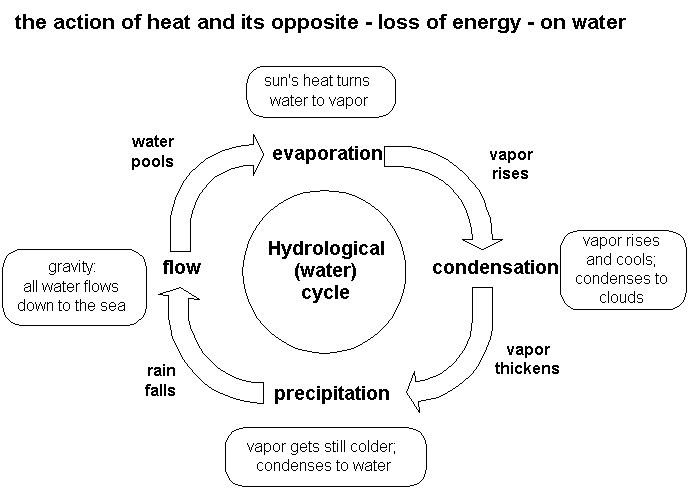
Here are some notes on the water cycle:

Hydrological (water) cycle

Precipitation & flow: “whether they are typhoons or Scotch mists, mountain torrents or field ditches or city sewers, they are simply water sinking back to base level, the sea.”

Evaporation = the act of passively presenting water to the atmosphere to be soaked up + vaporized by the sun’s energy.

Transpiration= evaporation thru plants

plant draws water from grd thru roots up to open-pored vessels in leaves, from which it is vaporized.

Condensation: as warm air rises it cools -7C every 1000m until it can’t hold it’s cargo of water vapor any longer condenses into clouds, which cool further, condensing further into rain drops.

warm front: when warm air advances on cold it rises over it.

cold front: when cold air advances on warm + forces it to rise.

In this example, the notes are neat and tidy, with headings and indentations showing a degree of organization. Terms are defined. The notes appear to encapsulate the main ideas. A few abbreviations are used. So far so good — these are all widely cited recommendations for effective note-taking.

Here's a different approach.

(If you click on the links at the bottom, you'll be able to see better images.)

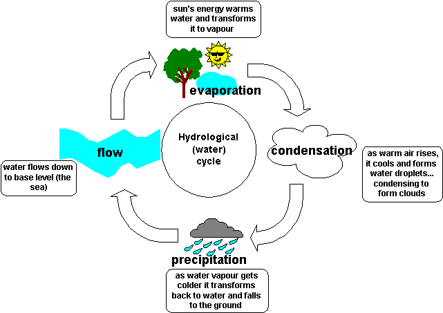
This one’s a picture. What is called in the trade a multimedia summary: a concise summary combining words and pictures. This has an advantage over the first example in that we can actually see the cycle, we can see the connection between the elements of the water cycle.

In the first example (a topical summary), we had the main points, but it didn’t go beyond the information presented in the text. Similarly, the above example (a multimedia summary), shows more connection but less detail, but also doesn’t go beyond the points given.

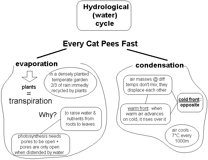
Now look at this one

There’s no more detail in this one, but it not only connects the ideas, it has taken the information another step. To the principle beneath the connection. To a higher level of abstraction.

You may think of summarizing strategies in terms of a matrix weighing amount of detail against degree of abstraction:


Degree of Abstraction / “Depth”


High

Low

Amount of

High

Best

Poor

Detail

Low

Rather vacuous

Really bad

The best type of summary is one that combines a high degree of abstraction with a high amount of detail. Our third water cycle example has a high level of abstraction but little detail — rather vacuous.

This one has the details. It also has a mnemonic, to help prompt my memory for the elements of the cycle and remember their order. This information could equally well have been presented in a linear format.

Together, these two examples combine detail and abstraction to form an effective summary.

Elaborating the information for better remembering

  • Elaborative interrogation involves turning facts to be learned into why-questions and then answering them.
  • The strategy is of proven effectiveness when the information to be learned concerns familiar concepts.
  • Elaborative interrogation is a useful strategy when:
    • you need to understand the information as well as remember it
    • you already possess sufficient related knowledge to use the strategy effectively

Elaborative interrogation is a strategy to help you remember meaningful information. The idea behind the strategy is that relevant prior knowledge is not always readily activated when you are trying to learn new information, and sometimes help is needed to make the right connections. The strategy requires you to go beyond the information given to you and to construct reasons for the relationships between bits of information.

Because elaborative techniques help your understanding by relating new information to codes already stored and familiar to you, elaborative interrogation is a strategy best suited to a situation where the information you wish to learn relates to a rich network of information in your database1.

An example:

Some facts:

arteries are thick and elastic and carry blood that is rich in oxygen from the heart.

veins are thinner, less elastic, and carry blood rich in carbon dioxide back to the heart.

Now if you know nothing else about veins and arteries and the circulation of blood, this is a set of facts with little meaning. You can learn this information

  • by rote (through simple repetition), or
  • by using a mnemonic aid (for example, you could make up a sentence such as “Art (ery) was thick around the middle so he wore trousers with an elastic waistband”), or
  • by understanding the connections between the facts.

Guess which way will help you remember the information much better for longer?

Let's ask some why questions.

Why do arteries need to be more elastic than veins?

Why do arteries need to be thicker than veins?

Why do arteries carry blood away from the heart?

Why do arteries carry the blood that is rich in oxygen?

These four questions lead directly from the facts as they are given. But we can also reinterpret these questions in a way that integrates the facts at a deeper level.

When we ask: Why do arteries carry blood away from the heart? it may be that the right question really is: Why do the vessels carrying blood from the heart need to be thicker and more elastic?

When we ask: Why do arteries carry the blood that’s rich in oxygen, it may be that the right question actually is: Why do the vessels carrying oxygen-rich blood need to be thicker and more elastic?

Or it may be that the right question is: Why do the vessels carrying blood from the heart need to be rich in oxygen? That question takes us another step: Why should blood be rich in oxygen? Why is blood sometimes rich in oxygen and sometimes rich in carbon dioxide?

Why do arteries carry the blood that is rich in oxygen?

? = Why do the vessels carrying blood rich in oxygen need to be thicker and more elastic?

? or = Why do the vessels carrying blood from the heart need to be rich in oxygen?

Why should blood be rich in oxygen?

Why is blood sometimes rich in oxygen and sometimes rich in carbon dioxide?

Why are arteries thicker and more elastic than veins?

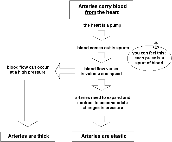
pictorial representation of this information

(You can see better images if you click the links at the bottom.)

Arteries are thick and elastic because they carry blood from the heart, which pumps blood out in spurts.

Veins are thin and less elastic because they carry blood to the heart in an even flow.

So all these facts — arteries are thick and elastic and carry blood from the heart; veins are thinner, less elastic, and carry blood back to the heart — are connected. So far so good.

But we still have a couple of loose facts. What has any of this got to do with the fact that arteries carry blood rich in oxygen and veins carry blood rich in carbon dioxide?

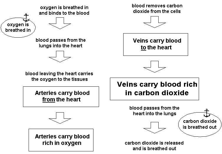
pictorial representation of blood flow information

So the fact that arteries carry oxygen-rich blood is connected to the fact that arteries carry blood from the heart; and veins carry carbon dioxide-rich blood because they carry blood to the heart — and all of these are connected to the well-known fact that we breathe in oxygen and breathe out carbon dioxide. Just as our earlier cluster of facts — that arteries are thick and elastic and carry blood from the heart — was connected to the well-known fact that the heart is a pump.

Remember:
Facts that you already know very well and have no trouble remembering act as anchor points. The more anchor points you can connect to, the more meaningful the new information becomes, and the more easily you will remember it.

References
  • Bransford, J.D., Stein, B.S., Shelton, T.S. & Owings, R.A. 1981. Cognition and adaptation: the importance of learning to learn. In J. Harvey (ed.). Cognition, social behavior and the environment. Hillsdale, NJ: Erlbaum.
  • Pressley, M. & El-Dinary, P.B. 1992. Memory strategy instruction that promotes good information processing. In D. Herrmann, H. Weingartner, A. Searleman & C. McEvoy (eds.) Memory improvement: Implications for memory theory. New York: Springer-Verlag.

1. Willoughby, T., Desmarais, S., Wood, E., Sims, S. & Kalra, M. 1997. Mechanisms that facilitate the effectiveness of elaboration strategies. Journal of Educational Psychology, 89, 682-685.

Outlines and Graphic organizers

Graphic organizers

  • need more time to process than outlines
  • are of little value when the text is short and simple
  • are helpful for constructing super-clusters

Outlines

  • are easier and quicker to process than graphic organizers
  • are better for shorter, simpler texts
  • are effective for rote-learning facts

Effective Notetaking

Graphic summaries are summaries that reorganize the text. Two examples of graphic summaries are outlines and graphic organizers.

In an outline, topics are listed with their subtopics in a linear format, like this:

Branches of Government (U.S.A.)

I.

Executive Branch


A.

Represented by:

President


B.

Powers:

Can recommend legislation; veto legislation; appoint judges


C.

Length of term:

4 years; maximum term 8 years

II.

Legislative Branch


A.

Represented by:

Congress


B.

Powers:

Can enact legislation; override veto; reject and impeach judges; impeach President


C.

Length of term:

2 years (House of Representatives) or 6 years (Senate); no maximum term

III.

Judicial Branch


A.

Represented by:

Supreme Court and other federal courts


B.

Powers:

Can declare legislation unconstitutional


C.

Length of term:

life

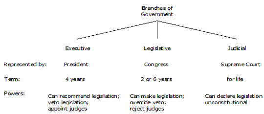
Graphic organizers show the same sort of information, but in a more visual format, like this:

This is a tree diagram. Although graphic organizers can come in many forms, most commonly they are either tree diagrams or matrices. Here is a matrix of the same information:


Executive Branch

Legislative Branch

Judicial Branch

Represented by

President

Congress

Supreme Court

Term

4 years

2 or 6 years

Life

Powers

Can recommend legislation;
veto legislation; appoint judges

Can enact legislation;
override veto;
reject and impeach judges; impeach President

Can declare legislation unconstitutional

Basically, graphic organizers are visual outlines showing relationships. Both outlines and graphic organizers are useful strategies for hierarchical information. However, while an outline does pick out the most important information and does show hierarchical relations (and, as you may have noticed, can include more detail more easily), it is not as effective in showing the relationships between concepts.

Compare the examples. In the outline, the clusters within a topic are clear, but the relations between topics — between the clusters — are not. The graphic organizer, on the other hand, allows connections between clusters to be more readily seen. Notice how much easier it is to grasp the similarities and differences between the different branches of the U.S. Government when looking at the tree diagram or the matrix, compared to looking at the outline.

In general, graphic organizers are more effective than outlines — but not invariably. In a study involving text summaries, graphic organizers were superior only when the students had enough time to study them properly — but where the students did have enough time, those who had studied the graphic organizer tested just as well after two days as they had when tested immediately, while those who had studied the outline performed more poorly (and those who had only read the text were worst of all). In other words, graphic organizers are much better for long-term recall (which is, after all, what you usually want!). This appears even more true when the text is longer.

But graphic organizers can be less effective than outlines, and this may be because graphic organizers can make it too easy to see the relations, and the reader doesn’t need to work as hard to understand the material, with the consequence that the material isn’t processed to the extent that it needs to be for lasting memory. This doesn’t apply, of course, if you’re constructing the graphic organizer yourself.

Graphic organizers have an advantage over outlines in terms of cognitive load. Working memory is thought to have two sub-systems — one that is essentially visual, and one essentially auditory. When we read text, notwithstanding we are receiving the information through our visual sense, we tend to encode it through the auditory working memory (words are fundamentally sound-based). There is evidence that graphic organizers use visual working memory more than auditory, while outlines use auditory more than visual. The advantage of a graphic organizer, therefore, may lie partly in its reduction of cognitive load — that is, by spreading the load on working memory between both systems.

Additionally, of course, the use of visual information in addition to verbal information creates more retrieval paths, increasing the chances of finding the information again.

All of this means that if outlines or graphic organizers are provided for you, even if the same information is also provided in the text, it’s worth spending time studying the outline/graphic. If an outline is provided, consider re-drawing the information as a graphic organizer.

As far as producing these yourself is concerned, outlines are easier to produce than graphic organizers, which is why they are much more popular. Although outlines are in general less effective than graphic organizers, both are generally more effective than conventional notes.

In two studies comparing note-taking formats in a ecture, both outlines and matrix notes were usually more detailed, better organized, and contained more ideas. Matrix notes were also slightly more coherent. But of course, the material was compatible with a matrix format, which is not always the case.

Although a graphic organizer is more effective, an outline is certainly sufficient in the right circumstances. Because it is easier to construct than a graphic organizer, if the material can be adequately described in an outline, you should use it. This will depend partly on the material itself, and partly on your goal. If you’re simply aiming to learn the “facts” (i.e., you’re not trying to develop your understanding), then research indicates an outline will be just as productive as a graphic organizer. If the text is short (1000 words or less), an outline is probably better. But with longer and more complex material, it would seem that graphic organizers are worth the trouble. In such cases, research also suggests that several graphic organizers are most effective — a warning that we shouldn’t try to cram too much information into a graphic organizer.

Remember, too, that graphic organizers, like outlines, are not designed to provide full notes — so you shouldn’t be trying to include everything. It’s all about selecting what’s important.

This article is taken from my book Effective note-taking

References
  • Benton, S.L., Kiewra, K.A., Whitfill, J.M. & Dennison, R. 1993. Encoding and external-storage effects on writing processes. Journal of Educational Psychology, 85, 267-80.
  • Bera, S.J. & Robinson, D.H. 2004. Exploring the boundary conditions of the delay hypothesis with adjunct displays. Journal of Educational Psychology, 96(2), 381-388.
  • Kiewra, K.A., Dubois, N.F., Christian, D., McShane, A., Meyerhoffer, M. & Roskelley, D. 1991. Note-taking functions and techniques. Journal of Educational Psychology, 83, 240-5.
  • Robinson DH & Kiewra KA 1995. Visual argument: Graphic organizers are superior to outlines in improving learning from text. Journal of Educational Psychology, 87, 455-67.
  • Robinson DH & Molina E 2002. The relative involvement of visual and auditory working memory when studying adjunct displays. Contemporary Educational Psychology, 27, 118-31.